


Table of Contents Show
Do your website visitors know what your business is all about in just 10 seconds? Is your web content and design appealing to your target audience? Can you generate leads with your website? Are you keeping up with your brand?
If you are looking for answers to the above questions then you are definitely at the right place. You might have invested thousands of dollars in creating your lovely website but that may not be delivering the expected results which you want to achieve. Without further ado, I would like to jump on the best web design tips quickly.
Here are the 13 best web design tips for awesome engagement:
1. Make a Site Revamp Plan:
Before jumping straight to making a new design for your website, start by creating a revamp plan. Even if you hire an expert to redesign your website, still you should have a plan to brief you about what are your goals and what resources you want to invest to achieve that goals.
Start by creating a buyer’s journey map to effectively meet the requirements that will benefit you the most. Create a full journey for your visitors who land on your website for the very first time till they are converted to become paying customers.
Make a list of the pages your visitors like to engage with the most and their conversion points. This will help you to design a website that will be effective in lead generation and be fruitful when you design your sales funnel.
2. Prioritize website speed:
Do you want to retain your website visitors for a longer time? Then you should prioritize optimizing your website speed. Many online businesses ignore the importance of website speed and this will affect your site rankings.
Experts say that website speed affects every website metric that is important for ranking from user satisfaction, usability, bounce rate, revenue, and conversions. If your website is slow and takes a lot of time to load the content, your visitors will surely leave your website and go to your competitor. Moreover, search engines don’t favor slow websites.
3. Make Use Of Visual Hierarchy
You should keep this thing in mind that every website page has a visual hierarchy. It is the visual elements of your webpage like color, size, arrangement, contrast, and images. The visual hierarchy determines how the arrangement will look to the human eye.

The web design experts use the visual elements architect to direct the visitor’s attention to the intended section, like the pricing section. So, whenever you want to go for a web redesign then keep in mind the visual hierarchy.
4. Focus On The Fold:
Many people talk about the importance of the fold in the website, but I want to emphasize the fold because my experience says that the fold is the decision-maker for your webpage. If visitors don’t like the fold, they will quickly leave your website.
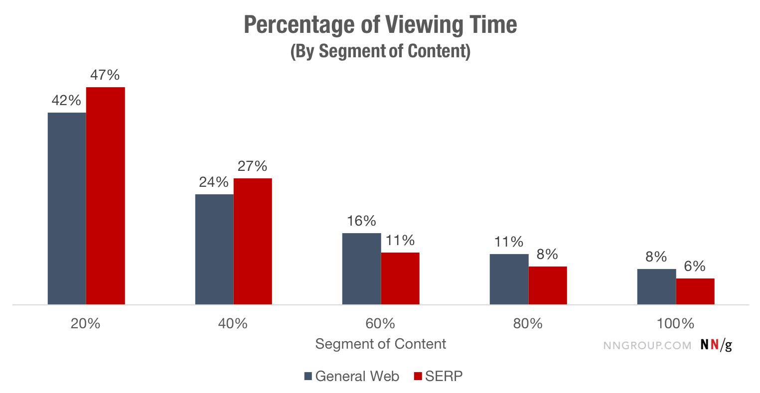
Research says that people spend proportionately more time on the fold the whole of the website. This accounts for more than 40% percent of the user’s whole stick to view the top 20% of the page.
To have a catchy fold area you should consider the following points:
- Use Media For Engagement: You should use videos, images, or audio messages to make your point clear. Media works well to deliver the message more creatively so try to leverage this opportunity.
- Use CTA (Call to Action): Just make sure that your CTA is clear and visible to your website visitors. It will be a good option to do A/B testing for your CTA. This will help you get the best results.
- Attention-Grabbing Headlines: Don’t use a very long headline for your fold but try to be concise and use your focus keyword. This will help your website users to learn what your website is about in the first glimpse.
5. Leverage Social Share Buttons:
If you have created an awesome website that gives the best offer in the industry, but you are not allowing your web users to share the content then this won’t work well.
You might be missing out on a lot of traffic on your website if your website doesn’t have a social share button. People like to share things with their friends and family that they admire and love.

Try to use different social media buttons on your website and keep in mind to don’t miss out on the email button because email is still the best channel for sharing content. You can use Twitter, LinkedIn, Facebook, Pinterest, WhatsApp, Tumblr, and many more depending on your target audience.
If you want to quickly upload social share buttons without coding then you can sign up for different tools that deliver easy installation or SaaS service to include social share buttons in one click. You can try SumoMe, HelloBar, and ShareThis for social buttons on your website. The best thing is that these tools also come in Free Packages.
6. Use the Navigation Bar:
The navigation bar is the key when you are mapping your website design. It displays the whole path through which a user has browsed through your website. Try to organize your navigation bar well so that your visitor does not get confused. Especially for e-commerce websites, the navigation bar is really important to equip website users with ease in online shopping. Try to help visitors by delivering the content that they are looking for.
Try to keep a lean navigation bar with a smooth hierarchy and good content that delivers the exact message. This is quite important to reduce your website bounce rates.
Check out this article to learn more about navigation bar science.
7. Don’t Use Carousel and Sliders
Simply speaking, “This gives a headache”. You know what? This is the most requested feature which is loved by clients. You might be shocked to hear that the carousels are useless. Research says that the first carousel gets more than 70% clicks, while the rest of the images in the carousel get just the minimum click-through rate.

A majority of website visitors just scan through your pages and they don’t have much time to read everything on your website.
8. Whitespaces- A Must For Website
No matter in which industry you are working you should leverage whitespaces for your website. It is essential to give a proper breakup to your page and improve the readability of your website content.
White space is the area on your website that has no image or content around the element. It is also called ‘negative spacing’.
You might think that this is superfluous but it gives better readability and prioritize your content. It helps well in positioning the design element in your design process. If your website lacks whitespace then readjust your web content to give a smooth user flow with the help of whitespaces.
9. Mobile Optimized Web Design
Is your website mobile-friendly? Does your website deliver the same value and user experience when browsed on mobile? You already know that about 80% of internet users are on mobile phones.
It is really important to tailor your website for mobile use. More importantly, Google has come up with its ‘Mobile First’ algorithm. While ranking on their search engine, Google bot first looks for the website on mobile rather than on the desktop and tablet versions.
10. Take Care Of Reading Pattern
The majority of website visitors read from top to bottom but among them, most of them read in Z pattern (left to right). This is the element of web design best practice that should be known to all the web designers and product designers too, so that they will create the design that caters to reading patterns for getting the most eyeballs on your concerned content.
Research says that people first scan the whole page and if they find interest they start reading in either the ‘F pattern’ or ‘Z pattern’.
F Pattern- For Blogs:
This pattern is applied to more text-contained landing pages like blogs, articles, and forums. First, the reader scrolls down the left side of the page and looks for the concerned keywords in the headings. If they think that the article has the information for what they are looking for then they read the article in F or E pattern.

Pro Tip: Make use of the left pane of your website. Try to use an attention-grabbing headline, subheadings, and bullet points. Align your content to get the most readership.
Z Pattern- For Homepage & Sign Up Pages:
The ‘Z pattern’ applies to landing pages like your homepage, pricing page, sign-up page, sales page, or checkout page. This is actually for the pages where the information is presented in the block paragraph form.
The website visitor first focuses on the top area of the page to find the important information, then goes down diagonally to the opposite corner and repeats the same action for the lower part of the landing page.
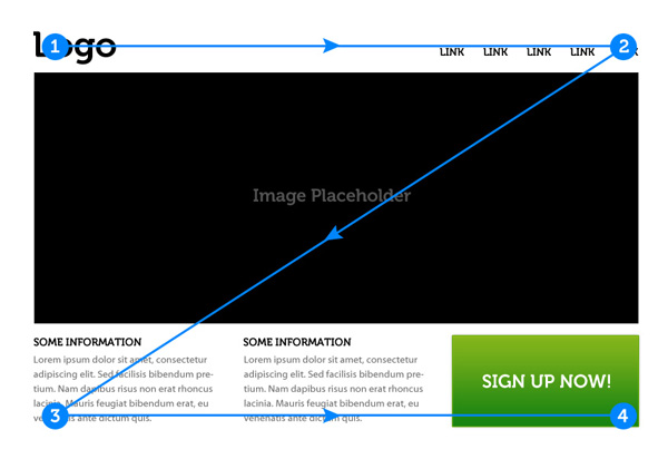
Web designers and product designers should construct their website that delivers these points, and place more emphasis on the top and down corners of the page.
11. Testing, Testing, Testing…
This is the most important of all the above points. Test your web design and develop your website several times across different platforms before delivering it to your clients or before going live.
Alexo Marketing has good development practices and protocols for delivering the best website to our clients. We create a website on testing servers and test the whole experience across multiple platforms before making it live on the concerned domain.
12. Keep Consistency
Make sure that you keep your web design consistent in terms of design layout, colors, button style, fold area, footer section, and CTA styles should be aligned with your web design guide. Don’t just add random elements, or sections to your website as that would look weird, and website users may think that something is not aligned on this website.
Try your best to give a great user experience that is consistent across the website. This eventually helps in better lead generation and conversion rates.
13. Make Your Website Better In Accessibility
You should take care of your audience and especially think of people with disabilities when starting your design process. Make sure that you don’t use elements or such colors in your website that are difficult to access by a certain user base. People having dyslexia find it difficult to read certain colors, fonts, and website elements.
So, choose the design elements wisely that allow people with disabilities to consume your content easily. Search engines nowadays rank better the website that takes care of accessibility.
What is your favorite web design tip?
Web designing is a technical job that requires a lot of knowledge and experience to deliver an awesome website that earns the intended revenue for online business owners. However, it requires much testing, tweaking, and improving the web page design to get better results. Just keep in mind that web design is just one of the elements of a successful online business operation. I will cover other elements in my other articles.
Stay tuned for more amazing content! Make sure to share your favorite design tips in the comments below, or email us at steve@productivityshift.com
More Resources For You: